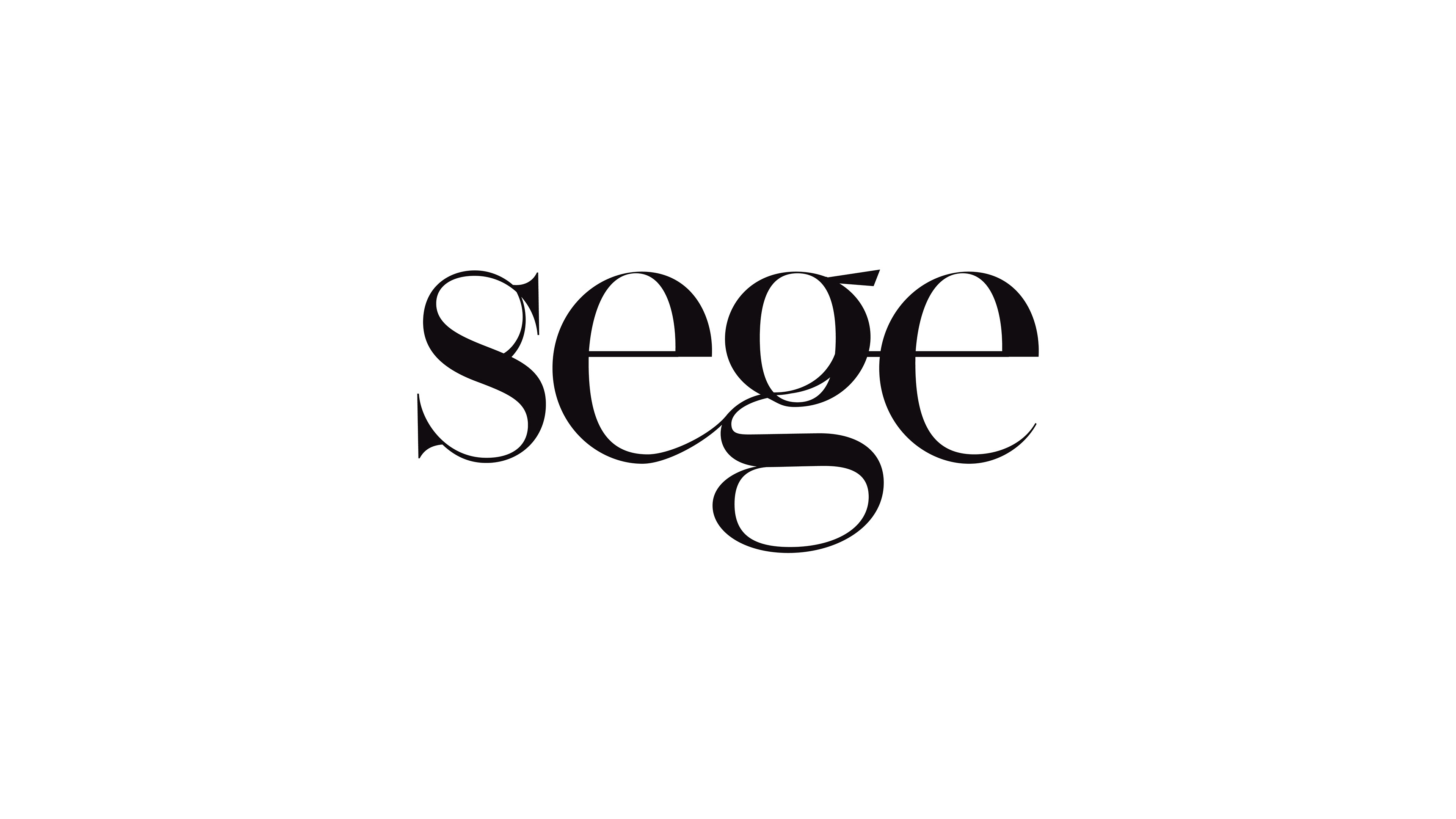
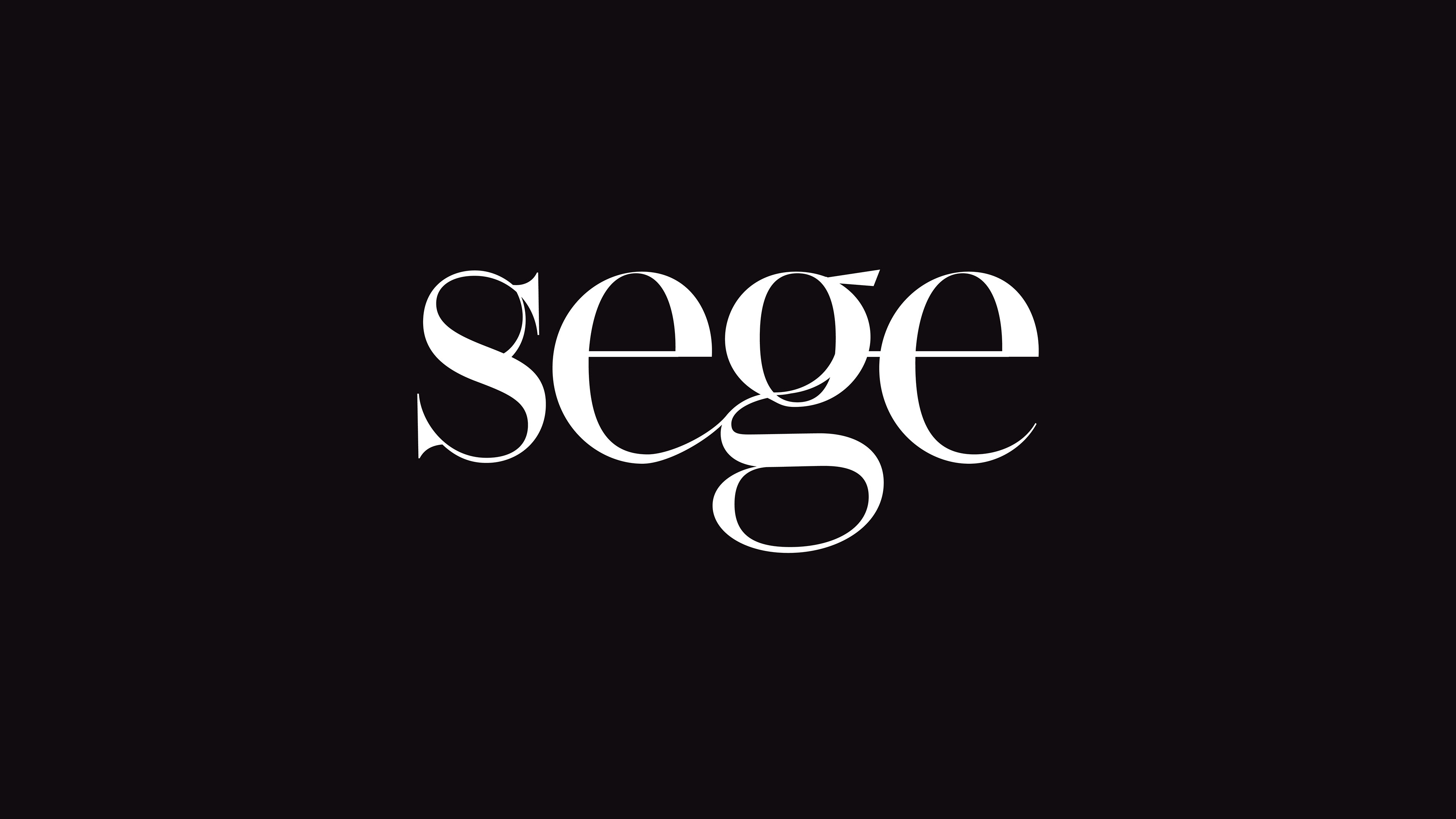
The logo and brand identity I created for Sege Architecture.
The Logo
The Sege Architecture logo is designed with the dynamism of architectural projects and the organic flow of design processes in mind. The typeface has been customized to create organic flows from the components of the letters.
The symbol of the Sege logo is crafted using the letter 'S'. This symbol, designed without disrupting the integrity of the logo, is shaped by the components within the letter 'S'. The organic and balanced form of the letter reflects the intersection of functionality and aesthetics. It serves as a typographic signature for Sege Architecture, while also showcasing the power of subtle details.
